Trend-Lines
The linear trend line in Excel is nothing more than the regression line you've learned in school. This trend line approximates how the expected value for y changes at different values of x. Here's an example of a regression line: y = a +bx
In a scatterplot, a residual is the vertical distance between the data point and the trend line. The smaller the distance, the better the prediction. The trend line has a smaller sum of squared residuals than any other line, that is why it is also known as the least squares line.
One of the most important skills you can have in the business world is being able to create a graph and show its trend line. I will now show you how to create a graph, and add its trend-line.
------------------------------------------------------------------------------------------------------------
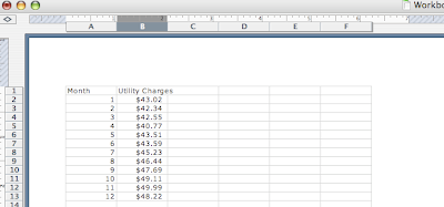
To begin creating your first chart, first open a new workbook and enter your desired data. The data used in the example will graph fictional monthly utility costs of an apartment. The data is fake and the images will be a compilation of my own 'print-screens.' Keep in mind I used Excel 2004 for Mac, so these instructions may differ for a more recent version.
1. Enter your desired data (Entered below are the months beginning with when I began collecting fake data and it's corresponding utility charge.) I have entered my data in the form of 'Month 1, Month 2' etc.
Also when filling in this information be sure to add in your data correctly, if not the data presented in the graph may not be representative. Notice in the image above I have matched each utility charge to its correct numerical month.
2. Highlight the information you wish to include in the chart. I have highlighted the month and then that month's utility charge. Do this by holding down on the first-most left cell of which you wish to include, and drag this down to include all the data you wish to include.
Notice that I have not included the headers 'Month' and 'Utility charge' because I do not wish this to be in my data set.
3. Click on Insert. A menu will drop-down, and follow it down until you find Chart.
4. Chart Wizard will bring up a list of charts that may be suitable for your data. Scroll down each type of chart and find one that best fits your data. I believe a scatter plot will best represent my data so I clicked on XY (Scatter.) To select, click on the Chart Type's title and highlight it, than click the Next button.
5. The Next button should bring up the Chart Source Data dialog box which will tell the Excel program which data to use. At the top of this box there should be two tabs Data Range tab and Series tab. Click on the ladder, Series tab. You may feel free to explore the Data Range tab but listed below will only include the Series Guidelines.
6. Check that the data match your X and Y values.
Excel will automatically assume which values to be on your X and Y. To make sure this is correct look to see that the information in the X Values box correspond to that on your spreadsheet. For example: In my data set, my X values will have the code:
The letters A in this code correspond to the information in column A. Notice that also in the code is 2 and 13. This will tell the program that you wish to include data points from cells 2-13. This code altogether tells the program to include all cells from column A and from cell rows 2-13. Make sure this 'code' corresponds you're X and Y values to the data in your spreadsheet.
7. Click Next to continue to your dialog box Chart Options. Give your graph a Title, and be sure to label your X and Y axis's and include the units to each. Above this are tabs to customize your graphs. Feel free to play around with these tabs but descriptions for other variations will not be provided in the scope of this guildelines.
8. Click Next once you are happy with the specifications of your graph and it will lead you to a new dialog box. If you wish to include your graph with your spread sheet click As object in bubble. This will include your graph in the spread sheet you created. You can also create this graph to appear in a new sheet. I will include it with my spread sheet. Click Finish to complete your graph.
9. Your chart should now appear on your spreadsheet.
10. If you are discontent with the appearance of your graph you may change it by clicking on one of the points. All of the points should now be highlighted. A dialog box Format Data Series box should appear. Edit the preferences of your graph here such as the Background, Foreground and Bullet Preferences. Once you have finish this, again click OK to finish.
11. Finally to add a trend line, right click any point on the graph. A drop down menu will appear, scroll down to Add Trend line.
12. A dialog box will appear and a list of types of trend lines will appear. There are two tabs, Type and Options. Under the Type tab choose which graph type you would like. Feel free to explore the options tab as well. For this graph I chose to include a Linear trend line. Click OK to finish.
This tutorial was created to help you excel at Excel Charts. I hope you have learned a lot and that these diagrams have helped you.


